The fun of coding a website from scratch is that you end up having complete control over its design and operation. You can create any website – a personal blog, an online portfolio, or a company website. The foundation with which the approach will help you in creating a refined, responsive, and interactive website. We will proceed to discuss the major steps for coding your website in this guide.
Understanding the fundamentals of web development
Before diving into coding, it’s crucial to grasp the basics of web development. Websites are primarily constructed using three fundamental technologies:
- HTML (Hypertext Markup Language): This is the backbone of web development, providing the essential structure of web pages. HTML elements are used to define headings, paragraphs, links, images, and other content that make up a webpage.
- CSS (Cascading Style Sheets): CSS enhances a website’s visual appeal by controlling the layout, colors, fonts, and overall aesthetic. This allows developers to create responsive and visually engaging designs.

- JavaScript: This programming language adds interactivity and dynamic behavior to web pages. JavaScript enables features such as form validation, animations, and content updates without requiring a full page reload, making websites more engaging and user-friendly.

Using these three technologies in combination, you can build anything from a simple static landing page to a fully dynamic online application. Mastery of HTML, CSS, and JavaScript forms the foundation for any web developer.
Planning Your Website
Before jumping into the actual coding, it’s essential to begin with a comprehensive plan for your website. Every successful project starts with a clear understanding of its objectives. Here are some steps to consider:

- Define the Website’s Purpose: Determine what your website aims to achieve. Are you providing information, selling products, or offering a service? Understanding your goals will guide your decisions throughout the development process.
- Identify Your Target Audience: Knowing who will use your website is crucial. Consider their preferences, needs, and behaviors. Tailoring your content and design to your audience will enhance user experience and engagement.
- Outline Necessary Components: List the essential features and pages your website will need, such as a homepage, about page, contact form, and product pages. Think about how users will navigate through your site and the content required for each section.
- Create Wireframes or Prototypes: Sketching out wireframes or prototypes allows you to visualize the layout and structure of your website before coding begins. This can include positioning elements like menus, buttons, images, and text blocks. Prototyping tools can also help create interactive mockups to refine the user experience.
- Identify Content and Functionality: Determine what content will be included, such as text, images, videos, or forms. Consider any specific functionalities, such as e-commerce capabilities or user login features.
By taking the time to identify your content, design layout, and functionality at this stage, you will save yourself significant time and effort down the road. A well-thought-out plan will guide your coding process and lead to a more efficient development experience, ultimately resulting in a better final product.
Selecting the appropriate tools and technologies
Now that you have a plan in place for your website, the next step is selecting the right tools and technologies for development. Modern web development encompasses a vast array of tools that cater to various aspects of the process, from coding to testing and deployment. Here’s how to approach this selection:
Choosing Your Tools
- Code Editors and IDEs: The choice of a code editor or Integrated Development Environment (IDE) is fundamental. Simple text editors like Notepad++ or Visual Studio Code offer straightforward interfaces with essential features such as syntax highlighting and basic code formatting. On the other hand, more complex IDEs like Sublime Text or WebStorm provide advanced features like debugging, code completion, and integrated version control, which can significantly enhance productivity and streamline the development process.
- Web Browsers for Testing: Selecting the right web browsers for testing is crucial for ensuring your site works properly across different platforms. Popular choices include Google Chrome and Mozilla Firefox, both of which come equipped with powerful developer tools that allow you to inspect elements, debug JavaScript, and monitor network activity.
- Frameworks and Libraries: To accelerate your implementation process, consider using frameworks and libraries tailored to your project’s needs. For front-end development, frameworks like React, Angular, or Vue.js can help manage your UI efficiently, while back-end frameworks like Node.js, Django, or Ruby on Rails streamline server-side development. Additionally, libraries like jQuery can simplify DOM manipulation and AJAX calls, further enhancing your development speed.
Configuring Your Development Environment
Once you have selected your tools, the next phase is to configure your development environment effectively:
- Install a Code Editor or IDE: Download and install the chosen code editor or IDE on your computer. Customize your settings and preferences to create a comfortable coding environment.
- Set Up a Testing Browser: Ensure that you have the latest version of your chosen testing browser installed. Familiarize yourself with its developer tools, as they will be essential for troubleshooting and optimizing your site during development.
- Enable Version Control with Git: Integrating version control into your workflow is vital for tracking changes and collaborating with others. Install Git and create a repository for your project. This will allow you to commit changes, revert to previous versions, and collaborate more effectively with other developers.
- Establish a Local Web Server: Setting up a local web server is an excellent way to test your website while it is still in development. Tools like XAMPP or Node.js allow you to run a local server environment that mimics how your site will function in a live setting. This is particularly important for testing dynamic content, APIs, and database interactions.
By following these steps, you will create a robust and efficient development environment that supports your web development efforts. This preparation will allow you to focus on writing high-quality code and implementing features effectively, paving the way for a successful website launch.
Creating the structure using HTML
HTML is the most fundamental foundation of any web page and serves as the backbone for web development. When creating a web page, it is crucial to begin by structuring the bare bones of your content. This involves using various HTML tags to define the layout and organization of your page. Here’s how to effectively structure your web pages:
Structuring Your Web Page with HTML
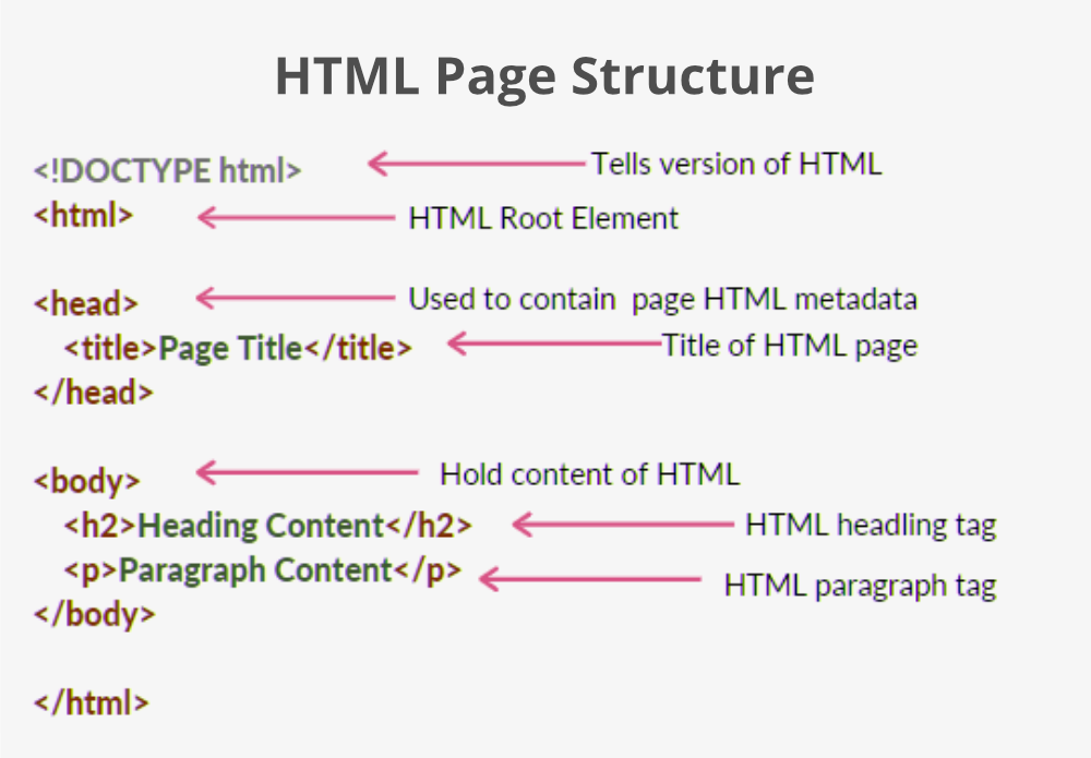
- Use Semantic HTML: Start by incorporating semantic HTML elements that clearly define the different parts of your web page. Tags such as <header>, <nav>, <section>, <article>, and <footer> are essential for organizing your content.
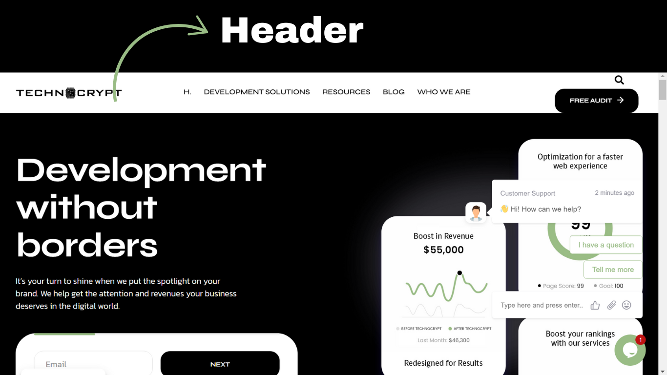
- <header>: This tag typically contains introductory content or navigational links. It often includes the website’s logo, title, and main navigation menu.
- <nav>: Use this tag to encapsulate your navigation links, making it easy for users to find their way around your site.
- <section>: This tag is used to define the thematic grouping of content. Each section can contain its heading and related content.
- <article>: This tag is perfect for self-contained content, such as blog posts or news articles. It can stand alone and be distributed independently from the rest of the site.
- <footer>: This tag typically houses information about the author, copyright details, and other relevant links.
- Organize Your Content: By utilizing these semantic tags, you not only help organize your content effectively but also enhance the readability of your code. This makes it easier for both you and other developers to understand the structure of the page.
- Improve SEO: Using semantic HTML is also beneficial for search engine optimization (SEO). Search engines use the structure of your HTML to better understand the content of your pages. Proper use of tags helps search engines index your site more effectively, potentially improving your visibility in search results.
Best Practices for HTML Structure
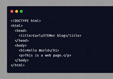
- Keep It Clean: Write clean and well-organized code. Avoid unnecessary nesting of elements and strive for a logical flow that mirrors the visual layout of your site.
- Use Proper Indentation: Maintain consistent indentation to make your HTML more readable. This helps you visually distinguish between parent and child elements.
- Comment Your Code: Add comments within your HTML to explain the purpose of certain sections. This can be especially helpful for future reference or for other developers who may work on your project.
By starting with a solid HTML structure and adhering to best practices, you set a strong foundation for your web page. This approach not only enhances the user experience but also contributes to the overall performance and searchability of your site.
Styling Your Website With CSS
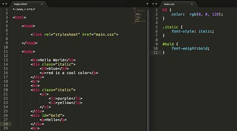
Once your structure is in place, use CSS to style your site. Style is a part of making your HTML elements look more aesthetic with colors, fonts, spacing, and layout. First, we will create a separate stylesheet file, styles.css, and connect it with the HTML file; CSS would require you to select elements using selectors and then the specific properties like color, font size, margin, padding, etc. You may also use either the flexbox or grid layout to produce responsive designs that change easily with screen sizes.
Now that your site looks sweet, add some interactivity using JavaScript. It can add such dynamic features to your site like picture sliders, pop-up modals, form validation, and many more. You can write it directly in your HTML file or else in a separate file with a .js extension. Using JavaScript lets you actually manipulate your DOM, make the site respond when different events happen, and so forth.
Responsive Design for Mobile Compatibility
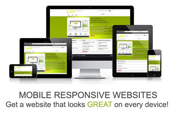
One of the most fundamental aspects of web development today is ensuring your website is responsive and built to be mobile-friendly. This can be done with CSS media queries and flexible grid layouts. The result is designing your website to adapt and adjust to any screen size, ensuring that all users enjoy a seamless functionality experience through their phones, tablets, and desktops. This is achieved by using breakpoints in the CSS file and changing the look and feel of the page depending on the width of the screen. Therefore, test your site on multiple devices.
Add images and videos to enhance the look of the website. Use the tag for the images and the tag for videos. Media files must be optimized to ensure fast loading times, which can be done by compressing the files without compromising on the quality. Using more modern formats like WebP for images and adding alt text for easy accessibility and better SEO is a good idea.
Incorporating External Libraries and Frameworks
In addition to HTML, CSS, and JavaScript, incorporating external libraries and frameworks into your project can significantly enhance development efficiency and streamline the process of building complex websites. Here’s how they can be beneficial:
Utilizing Libraries and Frameworks
-
JavaScript Libraries:
jQuery: This widely-used library simplifies many common JavaScript tasks, such as DOM manipulation, event handling, and AJAX requests. With jQuery, you can write less code while achieving more, making it easier to add interactive features to your web application.
-
CSS Frameworks:
Bootstrap: This popular CSS framework offers a wealth of pre-designed components and layout grids, which allow you to quickly build responsive, mobile-first web pages. By using Bootstrap’s grid system and pre-styled elements like buttons, forms, and navigation bars, you can save time and ensure consistency across your design.
Implementing Server-Side Scripting
For more complex web applications, server-side scripting becomes essential for providing dynamic content. This involves writing code in languages such as PHP, Python, or Ruby, which enables you to interact with a database for storing and retrieving information. Here’s how server-side scripting enhances your project:
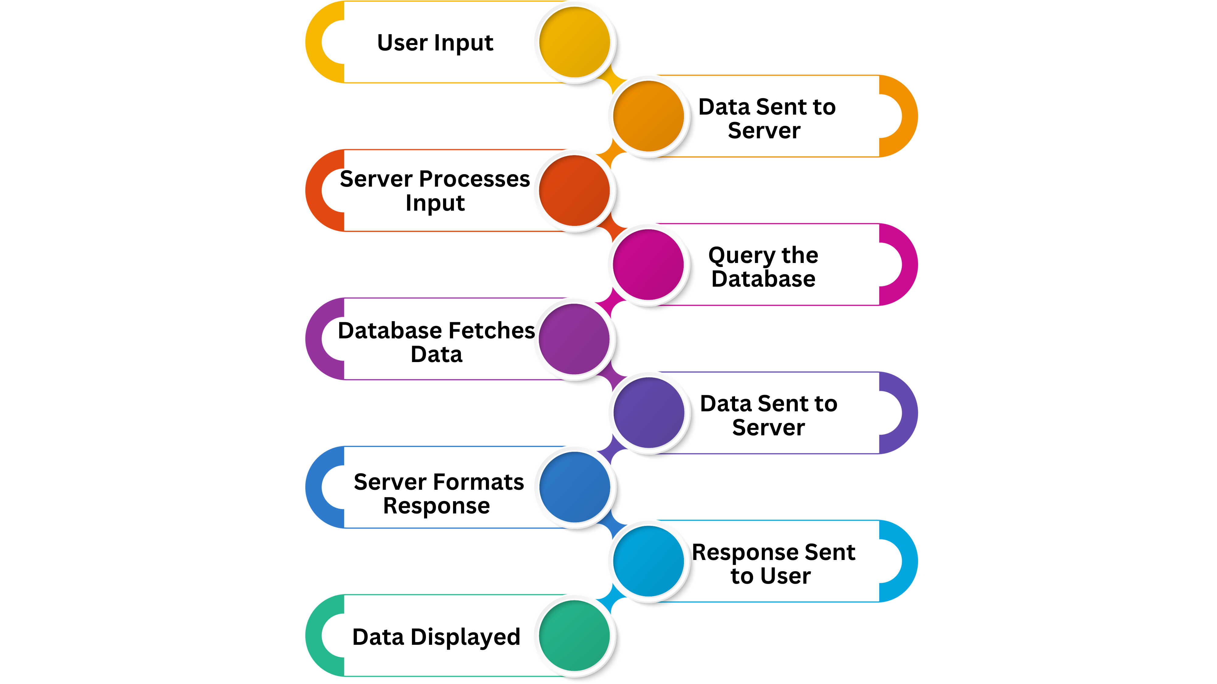
- Dynamic Content Generation: Server-side scripting allows your site to generate content dynamically based on user interactions or requests. For example, a user logging into a website may trigger a server-side script that fetches personalized data from a database, such as their profile information or recent activity.
- Database Connectivity:
 By connecting your application to a database management system like MySQL or MongoDB, you can store user data, manage content, and facilitate various functionalities such as:
- Login Systems: Implement secure user authentication and authorization to control access to different parts of your application.
- Content Management Systems (CMS): Create a dynamic system that allows users to add, edit, and delete content without needing to modify the codebase directly.
- Personalized User Experience: Tailor content and features based on user preferences and behaviors, enhancing user engagement and satisfaction.
- By integrating external libraries, CSS frameworks, and server-side scripting into your web development process, you can create more robust, feature-rich applications efficiently. These tools not only accelerate development but also enhance the user experience by delivering dynamic, interactive content tailored to user needs.
Building Forms for User Interaction
Of course, no website asking for user input would be ever complete without forms. Forms for signing up, feedback, or orders can be written using HTML using form elements such as <input>, <textarea>, and <select>. For assurance that a user has entered the required information, JavaScript will validate forms in real-time. Validations should also be done on the server side for security reasons.
Navigation is what directs users through many sections of a website. Generate a simple navigation bar on every page or section, using the unordered list ul and links a. It’s possible to use JavaScript to produce dropdown menus, or to highlight active links, and of course, you would use CSS to style your navigation. Make sure that navigation is clear and user-friendly on all devices.
The only way you can give your users a fast and flawless experience is to ensure your website is optimized. Methods such as minimizing CSS and JavaScript, image optimization, and using caches may significantly reduce load times. Tools like Google PageSpeed Insights may also point out performance problems along with their suggested fixes.
It is more or less dependent on the testing of a website. Test your website frequently on multiple browsers and devices to ensure that it is compatible with all such platforms. Use the developer tools given by Chrome, Firefox, or Safari to debug any issues that may be occurring. Search for any occurrence of JavaScript bugs, inspect CSS styles, and confirm that all links and images load as expected.
Launching Your Website onto a Web Server
Launch your site online once you’ve created it. Select a hosting web service, then upload the files via FTP or SSH. While services like Netlify and Vercel will happily deploy from your Git repository, some hosts have pre-configured deployment features built right in.
Monitor your site and see that it works as expected after the deployment. Monitor the activity of users and performance using tools like Google Analytics. Iterate the code with frequent updates; solve issues; and apply security patches for it to work and to protect it from attacks.


