Frontend web development runs behind everything we see and interact with online. Ever wondered how websites manage to look so sleek, run smoothly, and feel intuitive to use? That’s all thanks to the brilliance of front-end development. It transforms raw data and technical elements into something visually engaging, interactive, and user-friendly. It’s the art of creating an experience that feels natural and seamless without drawing attention to itself.
Think about all the times you’ve clicked a button, watched a smooth animation, or scrolled endlessly through a beautifully designed page—it’s front-end development that makes all of this possible. Every dynamic feature, every visual flourish, and every well-placed detail is a result of careful coding and design. It’s a balancing act between functionality and aesthetics, where the goal is to make things not only look amazing but also work flawlessly. In essence, front-end development is where creativity meets technology, crafting the digital spaces we explore every day.
Here’s why front-end development is more than just code:
- It’s all about user experience: Every click, animation, and scroll is designed to keep you engaged and make navigation easy.
- More than visuals: it’s about making things look good and ensuring every element—from buttons to forms—functions perfectly.
- Responsive design is key: Whether you’re on a phone, tablet, or desktop, a well-built front-end adapts to give you the best possible experience on any screen size.
- Bringing design to life: Front-end developers take static designs and turn them into interactive, living websites, making sure everything works seamlessly.
Core Technologies: HTML, CSS, and JavaScript
Front-end development is powered by three essential technologies: HTML, CSS, and JavaScript, each playing a vital role in building modern websites. Together, they create the structure, style, and functionality needed to deliver an engaging user experience.
HTML: The Blueprint
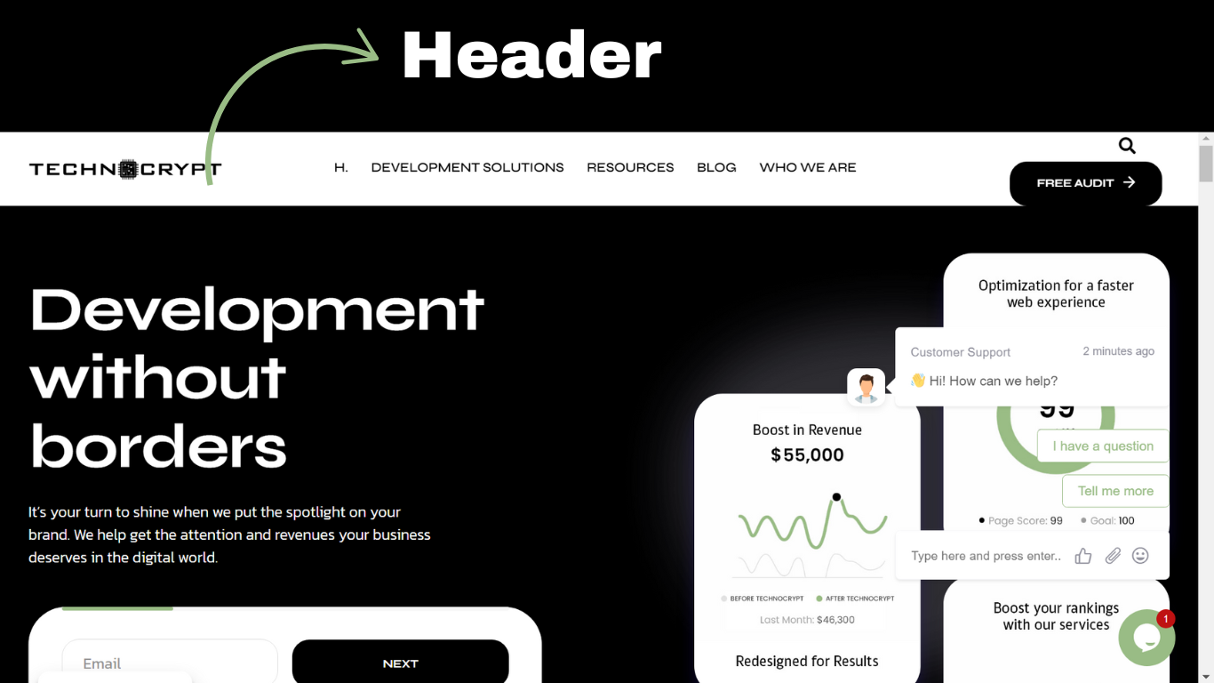
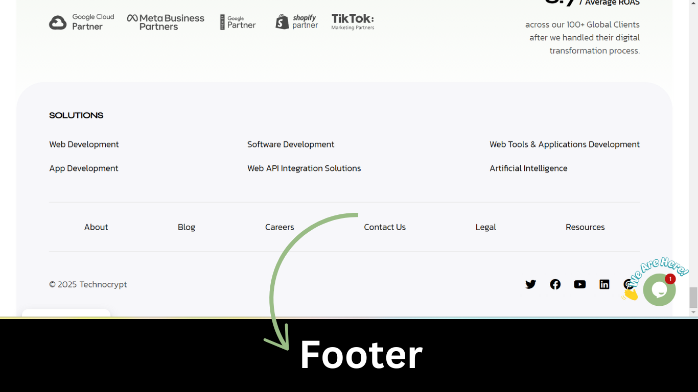
HTML (HyperText Markup Language) serves as the blueprint of a website, defining the structure and layout of content. It organizes elements such as headings, paragraphs, links, and images. The latest version, HTML5, enhances this by introducing semantic tags like <header> and <footer> for better readability, as well as built-in support for multimedia content like audio and video, eliminating the need for plugins.
 CSS: The Designer
CSS (Cascading Style Sheets) is where the magic of design happens. If HTML is the skeleton, CSS is the outfit and interior design, dictating colors, fonts, and layouts. CSS3 has completely transformed web design with features like animations, transitions, and responsive design—meaning websites look amazing whether you’re on a phone or a desktop. It’s the key to ensuring websites are both visually appealing and functional across all devices.
JavaScript: The Interactivity
JavaScript is the energy that makes websites feel alive. It’s the dynamic programming language that adds interactivity and functionality to your site. Whether it’s updating content without refreshing the page, creating interactive forms, or even animating elements, JavaScript is what gives websites a smooth, engaging user experience.

Why They Work Together:
- HTML sets the structure.
- CSS makes it look good.
- JavaScript makes it come alive.
Together, these three form a powerful team that ensures websites aren’t just functional, but also beautiful and interactive. This trio is responsible for creating everything from simple static pages to dynamic, interactive web apps that keep users engaged.
Responsive Design and Layout Techniques
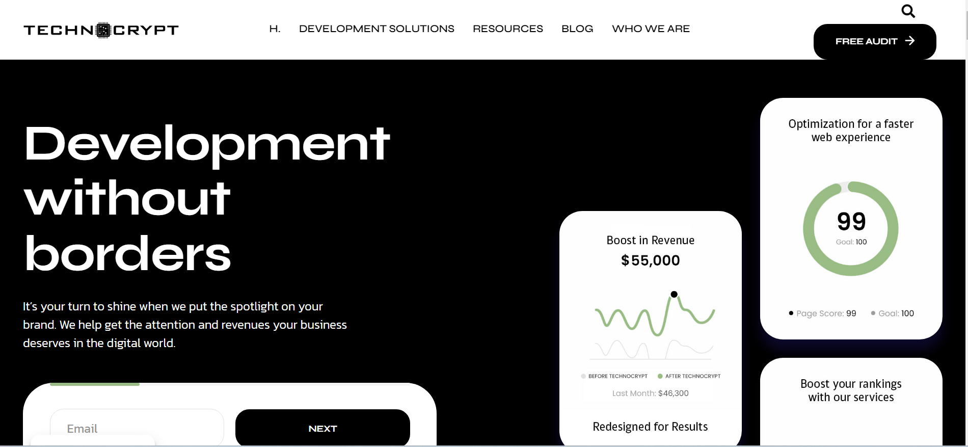
Responsive design is not just a feature—it’s an essential part of modern web development. In today’s digital landscape, users access websites from a wide range of devices, including large desktop monitors, tablets, and smartphones. Ensuring that your site looks appealing and functions seamlessly across all screen sizes is crucial for delivering a great user experience. Responsive design achieves this by dynamically adjusting the layout and elements of a webpage to fit the specific dimensions and capabilities of the user’s device.
To make this possible, front-end developers rely on key techniques and technologies, including flexible grids, fluid images, and media queries, alongside advanced layout tools like Flexbox and CSS Grid.
The Core Concepts of Responsive Design
- Flexible Grids
Grids are the backbone of web layouts, dividing the page into rows and columns. A flexible grid adjusts automatically based on screen size, ensuring that elements scale proportionally, whether viewed on a large screen or a small mobile device. - Fluid Images
Images in responsive design are scaled relative to their parent containers. Instead of fixed dimensions, images use percentages or themax-widthproperty to resize gracefully while maintaining aspect ratios. - Media Queries
Media queries are CSS rules that apply styles based on specific conditions like screen width, height, or orientation. For instance, they can hide elements, adjust font sizes, or rearrange layouts for smaller screens. They are the foundation for creating adaptive designs.
Flexbox: One-Dimensional Layouts
Flexbox (Flexible Box Layout) is a CSS layout model specifically designed for arranging items in a single direction—either in a row (horizontal) or a column (vertical). It’s perfect for creating responsive designs where elements need to be evenly spaced, aligned, or resized within a container.
- Alignment Control: Flexbox makes it simple to align items along both the main axis (row or column) and cross axis.
- Space Distribution: Items can automatically expand or shrink to fill available space.
- Reordering: Flexbox allows developers to reorder elements visually without changing their order in the HTML structure.
- Responsive Adjustment: Flexbox layouts can automatically adjust based on container size, making it ideal for responsive components like navigation bars, sliders, or rows of cards.
Example: A navigation menu created with Flexbox can center links horizontally, adjust their spacing dynamically, and even stack vertically when viewed on a smaller screen, all with minimal code.
CSS Grid: Two-Dimensional Layouts
CSS Grid Layout expands the possibilities of responsive design by introducing a two-dimensional system. Unlike Flexbox, which handles one axis at a time, CSS Grid allows developers to control both rows and columns simultaneously. This makes it ideal for complex layouts where precise placement of elements is required.
- Grid Tracks: Define rows and columns with explicit sizes, fractions, or flexible units.
- Grid Areas: Assign specific areas of the grid to elements, making it easy to rearrange content for different screen sizes.
- Adaptive Design: Grids can dynamically resize or reflow based on viewport dimensions, ensuring a seamless experience across devices.
- Content-Driven Sizing: Grid elements can size themselves based on their content, avoiding unnecessary whitespace.
Example: A webpage layout with a header, sidebar, content area, and footer can use CSS Grid to ensure each section aligns perfectly on large screens. On smaller devices, the grid can rearrange to stack these sections vertically for better usability.
Enhancing Responsiveness with Preprocessors
Developers often rely on CSS preprocessors like Sass or Less to streamline their workflow. These tools offer:
- Variables, nesting, and functions that make CSS more powerful and easier to manage.
- A reduction in repetitive code, helping developers write scalable and maintainable stylesheets.
- The ability to handle complex designs without cluttering the codebase.
By using these tools, developers can focus on creating highly organized and efficient styles while maintaining productivity and ensuring that websites remain responsive across all devices.
Frameworks, Libraries, and Preprocessors
When it comes to front-end development, Bootstrap stands out as a popular and powerful framework. It’s the go-to choice for building responsive, mobile-first websites, offering a wide array of pre-built components like navigation bars, modals, and form controls. One of its standout features is the grid system, which makes layout construction a breeze by providing a structured, easy-to-use framework for organizing content.
Key Benefits of Bootstrap:
- Pre-built UI components for faster development.
- A flexible grid system for creating responsive layouts.
- Consistency across different browsers and devices.
By simplifying the process of creating responsive designs, Bootstrap allows developers to focus on functionality and aesthetics without reinventing the wheel for each project.
JavaScript frameworks have fundamentally transformed the way developers build web applications. Frameworks like React, Angular, and Vue.js provide a structured approach that simplifies complex tasks and enables developers to build more scalable and maintainable applications.
- React:
 One of the most popular libraries, React is known for its component-based architecture. This approach allows developers to break down a user interface into reusable components, making it easier to manage large projects while improving efficiency. 
 - Angular:
 A robust framework developed by Google, Angular is ideal for building dynamic, single-page applications. Its two-way data binding and dependency injection make it highly suitable for complex web apps.
 - Vue.js:
 Known for its simplicity and flexibility, Vue.js is a lightweight framework that offers the best of both React and Angular. Integrating existing projects is easy and provides a progressive framework for building user interfaces.
Why Use JavaScript Frameworks?
- Efficiency: Write less code for more functionality.
- Reusability: Break down applications into manageable components.
- Scalability: Easily maintain and grow your application as it evolves.
Together, front-end frameworks like Bootstrap and JavaScript libraries like React offer developers the tools they need to build efficient, responsive, and scalable web applications faster than ever.
APIs and Dynamic Content Management
However, we should understand that the front end involves more than just presenting data; it also communicates with other systems. This is where APIs come into play. APIs, or Application Programming Interfaces, enable a website to interface with third-party services, such as weather apps, payment processors, and social media platforms. Developers can use the JavaScript fetch() method to receive data asynchronously, allowing the user interface to be updated in real-time without reloading the page.
Another significant technology for dynamically updating material on webpages is AJAX (Asynchronous JavaScript and XML). AJAX enables smoother user experiences by delivering and receiving data from the server in the background, such as loading new social network posts without having to refresh the entire feed.

Accessibility is another major aspect of modern front-end development. Web accessibility is the provision that assures websites’ accessibility by persons with disabilities, based on WCAG (Web Content Accessibility Principles). It could be an addition of alternative language to a photo, making sure that the colors chosen have a large enough contrast, or making sure that the website can be accessed through only a keyboard. Having an accessible website increases readership and can accommodate all visitors in a much more inclusive manner.
Performance, Accessibility, and Cross-Browser Compatibility
Performance optimization is a crucial aspect of front-end development, directly impacting both user experience and search engine rankings. Here are some key techniques developers use to ensure websites load quickly and run smoothly:

- Minifying Files: Removing unnecessary characters (like spaces and comments) from code to reduce file sizes, speeding up load times.
- File Merging: Combining multiple CSS or JavaScript files into a single file, which minimizes the number of requests made by the browser and enhances performance.
- Faster Load Times: A website optimized for speed not only provides a better user experience but also ranks higher on search engines, making performance a must for any developer.
Cross-Browser Interoperability: A Seamless Experience for All
One major challenge in front-end development is ensuring cross-browser compatibility. Websites and apps must be tested on multiple browsers—Chrome, Firefox, Safari, Edge—to ensure a consistent experience for all users.
- Browsers interpret code differently, so front-end developers rigoly test and debug their projrousects across platforms.
- The goal: A seamless experience, no matter which browser is used.
Version Control: Managing Code with Git
Good code management is essential for collaboration and efficiency, and Git is the tool of choice for tracking code changes. Git allows developers to:
- Monitor code changes.
- Roll back to previous versions if issues arise.
- Collaborate effectively with other team members.
Platforms like GitHub further streamline this process, offering a central repository where developers can share code, track progress, and collaborate on projects.
Automation Tools: Gulp and Webpack
Automation is key to streamlining the front-end development process. Tools like Gulp and Webpack handle repetitive tasks, freeing up developers to focus on more critical work. Gulp and Webpack are used for:
- CSS Compilation: Automatically compiling pre-processed CSS files.
- JavaScript Minification: Reducing JavaScript file sizes.
- Asset Bundling: Bundling various resources for improved performance.
These tools save time and ensure the final product is optimized for speed and efficiency.
Testing and Debugging: Ensuring Quality Code

Testing and debugging are critical to delivering a high-quality front-end experience. Automated testing tools like Jasmine, Mocha, and Jest ensure that code works as expected, while browser developer tools help debug in real time.
- Automated Tests: Catch issues early and ensure functionality.
- Developer Tools: Inspect the DOM, monitor network requests, and debug JavaScript issues—all in real-time.
Continuous Integration and Continuous Deployment (CI/CD)
CI/CD practices are essential for modern web development, enabling automatic integration and deployment of code changes.
- Continuous Integration: Automatically tests code changes to ensure nothing breaks before deployment.
- Continuous Deployment: Deploys updates without downtime, ensuring users experience smooth, uninterrupted service.

By incorporating CI/CD pipelines, front-end developers can frequently release updates and new features without causing inconvenience to users. This means quicker turnarounds, smoother workflows, and better overall product delivery.
Conclusion
In a nutshell, front-end development is the area of dynamic evolution and creativity as well as technical knowledge. Very critically, the job role of front-end developers changes the way we interact with the digital world, taking a skeleton of a webpage produced by HTML and bringing it to life using CSS and JavaScript. With new technologies coming and user expectations shifting, so does that role for front-end developers, making more potential for even more responsive, and accessible web experiences for all the users out there.


